Best Practices for Web Accessibility
Introduction
“The one argument for accessibility that doesn’t get made nearly often enough is how extraordinarily better it makes some people’s lives. How many opportunities do we have to dramatically improve people’s lives just by doing our job a little better?” – Steve Krug, Information Architect and Author of “Don’t Make Me Think: A Common Sense Approach to Web Usability”
Most resources in modern society have gone digital. With the digital frontier’s forefront come many challenges, not just for UX designers and developers, but also for the internet’s users: specifically, those that don’t fit the stereotypical mould. As of 2018, over 56 million people in the United States and over 1 billion people worldwide live with a disability (Stanley, 2018, para. 7). In the UK alone, 10% of the adult population was digitally excluded from the internet in 2018 as a result of persons being either unable or unwilling to access information and online services (Niyiawosusi, 2020, para. 5). With so much of the world going digital, and especially in the light of the shift to the digital world in light of the Covid-19 pandemic, it is imperative that all persons have access to digital resources, regardless of their abilities.
Unfortunately, it is common for websites and apps to not be designed with accessibility in mind. One of the reasons for this is that many companies and individuals believe it is too difficult to design with accessibility guidelines, or they believe following specific accessibility rules will be expensive (Stanley, 2018, para. 2). However, in 2017, at least 814 website accessibility lawsuits were filed in federal and state courts (Vu & Ryan, 2018, para. 2). Lawsuits, resulting in legal expenses and damage to brand image, could have been avoided by these companies if they had invested a little more time and research to solve their website problems or if they had designed for web accessibility from the start. In this guide, you will find resources, examples, and explanations to common accessibility related design problems. I hope this guide aids you in helping me create a more accessible future for all.
1. Color Contrast
Although it seems like color contrast is number #1 on everyone’s guide to accessibility, it is still a commonly overlooked problem. The World Health Organization estimated in 2018 that 217 million people had moderate to severe vision impairments (Stanley, 2018, para. 10). People with low vision have a difficult time differentiating text from background if the contrast is too low.
The contrast ratio between text and its background should be 4.5.1 in order to conform to level AA W3C Web Content Accessibility Guideline standards (Stanley, 2018, para. 11). With larger font sizes (at least 18 pt) the minimum contrast ratio goes down to 3.1 (Stanley, 2018, para. 11).
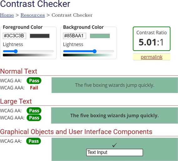
The WebAIM color contrast checker is probably the most popular tool for checking contrast ratios. You input the hex digits for the colors you are checking, and the checker will tell you whether or not they meet conformance levels A, AA, or AAA.
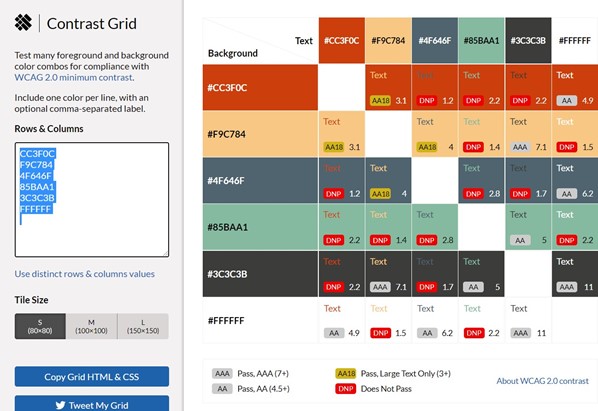
EightShapes Contrast Grid is a really helpful tool I found for when you want to contrast test several colors at the same time. I really like that it lets you test multiple combinations all at once, as well as copy the grid’s HTML and CSS.
1.2 Color isn’t Everything
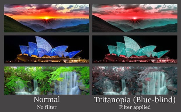
When it comes to conveying important information, color should not be the only visual cue. According to W3C guidelines, color should not be, “used as the only visual means of conveying information, indicating an action, prompting a response, or distinguishing a visual element” (W3.org, 2019, guideline 1.4 distinguishable). This is because it can be difficult for people with colorblindness or low visual acuity to understand what you are trying to convey (Stanley, 2018, para. 13). Instead of only using color, try adding text labels or patterns. It’s important to give users feedback on their actions, but the information is useless if it’s not understandable (Friedman & Bryen, 2007, p. 208). When it comes to feedback or errors, use an icon or title to the error message. Also, try using heavier font weight or underlining to help links stand out (Stanley, 2018, para. 14). Experiment with shapes, labels, size, and patterns to make sure the differences are distinguishable, even if the page were to be in grayscale (Stanley, 2018, para. 15). Colorblindly is a Chrome extension that can simulate in real time what color blind users will see on your website. Colorblindy offers several options so you can see what your site looks like to each version of colorblindness.
2. Typography and Alternative Text
When choosing a font for your design, be sure to pick one that is easy to read. While there aren’t any hard and fast rules in regards to accessible fonts, and there isn’t any one font that is the most accessible font, there are some font guidelines from WebAIM that are easy to follow:
1. Avoid character complexity
2. Avoid character ambiguity
3. Use a limited number of fonts and font variations
4. Consider spacing and weight
5. Ensure sufficient but not too much contrast between the text and the background
6. Avoid small font sizes and other anti-patterns
However, in regards to typography, there is a requirement from W3C to meet AA standards. The W3C quick reference guide section on text resizing requires that text have the ability to be resized without any special accessibility tools up to 200% without loss of content or functionality (W3C, 2019, guideline 1.4.4 resize text).
One thing most UX designers can agree upon, in regards to typography, is that text should at the bare minimum be size 12pt (Friedman, Bryen, 2007, p. 208).
Alternative text should be written for images and other non-text content. Blind and low vision persons use screen readers to navigate the web, so it is important to provide descriptions of pictures and non-text elements so that they can understand what’s happening in them. This is most often achieved by manually providing text that describes the content under the picture and by presenting the alternative text within the <alt> attribute of the image element (Stanley, 2018, para. 26-30).
3. Time Based Media and Animations
According to W3C guidelines on audio control, time based media, such as videos and music, should give the user the ability to pause or mute the media (W3C, 2019, guideline 1.4.2 audio control). This is important to avoid overstimulation of the users, especially for those who have autism, hyper-sensitivity, or ADHD. Videos, live media, and music should also have captions and/or provide a transcript according to WebAIM techniques regarding captions. This is important for deaf users, or users with other hearing disabilities.
For animations or videos, do not design media that could cause seizures or physical reactions. In W3C’s guidelines, they require, “web pages to not contain anything that flashes more than three times in any one second period,” and that, “Motion animation triggered by interaction can be disabled, unless the animation is essential to the functionality or the information being conveyed” (W3C, 2019, guideline 2.3 seizures and physical reactions).
4. Keyboard Accessible
While keyboard accessibility has mainly to do with component structure and is handled on the developer side, there are a few things UX designers can watch out for. Firstly, you can make sure that links make sense out of context. Avoid using links that say “click here” or “more,” as they will not make sense out of context if a screen reader is reading the links only (WebAIM, 2021). Secondly, you can make sure that focus indicators are usable. Keyboard only users, like those with limited mobility, injuries, and screen readers, use focusable elements to navigate the page. Examples of elements are links, buttons, and menu items. They need to have a highly visible state and good contrast that will make them stand out to users (Stanley, 2018, para. 17-20).
5. Feedback and Input Assistance
Out of 187 separate design recommendations, 15% of them cited giving feedback (such as errors) on a user’s actions (Friedman, Bryen, 2007, p. 208).
WebAIM techniques regarding form validation suggests designers should ensure that their users can complete every form available with validation on the web page and also recover from errors (WebAIM, 2021). A very big mistake that UX designers make is using placeholder text as the label for a form. This can cause issues with screen readers and causes users to lose context and focus on what they are writing. There should always be an essential cue available so that the user has enough information to complete the form (Stanley, 2018, para. 21-25).
Conclusion
The last resource I want to share is a massive game changer.
It’s called the WAVE Web Accessibility Evaluation Tool. This tool allows you to paste the link to a website into it and it then shows you if the site has any accessibility errors. It even lets you edit the code and insert hex digits to see if the change would fix the error.
Accessible web design can help drive innovation, enhance your brand, extend market research, and minimize legal risk (WAI, 2021, para. 1). Not only can accessible web design aid your business by giving it these tangible benefits, but it can also create a better web for people of all abilities. As UX designers, we have an ethical responsibility to create a more inclusive web for people of all abilities.
Bibliography
Accessibility in UX: The case for radical empathy. UX Magazine. (2020, December 20). Retrieved January 23, 2022, from https://uxmag.com/articles/accessibility-in-ux-the-case- for-radical-empathy
Barstow, J. C., About The Author John C Barstow has been writing software for over 30 years, & Author, A. T. (2021, November 23). Adding a dyslexia-friendly mode to a website. Smashing Magazine. Retrieved January 23, 2022, from https://www.smashingmagazine.com/2021/11/dyslexia-friendly-mode-website/
Building an accessibility library. UX Magazine. (2021, April 16). Retrieved January 23, 2022, from https://uxmag.com/articles/building-an-accessibility-library
Corradini, F., Brosset, P., Prater, S. V., Wills, M., PenzeyMoog, E., & Greenwood, T. (2019, April 17). Accessibility for vestibular disorders: How my temporary disability changed my perspective. A List Apart. Retrieved January 23, 2022, from https://alistapart.com/article/accessibility-for-vestibular/
Fisher, C., Brosset, P., Prater, S. V., Wills, M., PenzeyMoog, E., & Greenwood, T. (2019, August 22). Getting to the heart of Digital Accessibility. A List Apart. Retrieved January 23, 2022, from https://alistapart.com/article/getting-to-the-heart-of-digital-accessibility/
Friedman, M. G., & Bryen, D. N. (2007). Web accessibility design recommendations for people with cognitive disabilities. Technology & Disability, 19(4), 205–212.
Google. (n.d.). Colorblindly. Google. Retrieved February 6, 2022, from https://chrome.google.com/webstore/detail/colorblindly/floniaahmccleoclneebhhmnjgdfij gg?hl=en
Initiative, W. W. A. (2018, June 5). Web Content Accessibility Guidelines (WCAG) Overview. Web Accessibility Initiative (WAI). https://www.w3.org/WAI/standards- guidelines/wcag.
Libby, T., About The Author Todd is a professional web developer, & Author, A. T. (2021, July 9). Making a strong case for accessibility. Smashing Magazine. Retrieved January 23, 2022, from https://www.smashingmagazine.com/2021/07/strong-case-for-accessibility/
Metts, M. J., Welfle, A., Brosset, P., Prater, S. V., Wills, M., PenzeyMoog, E., & Greenwood, T. (2020, January 28). Standards for writing accessibly. A List Apart. Retrieved January 23, 2022, from https://alistapart.com/article/standards-for-writing-accessibly/
Niyiawosusi, O., Bungard, D., Cozzi, E., Overkamp, L., So, P., Hapsari, P., & Barth, L. (2020, June 12). Building the Woke Web: Web Accessibility, Inclusion & Social Justice. A List Apart. https://alistapart.com/article/building-the-woke-web/.
Shestopalov, S., About The Author Slava is a designer from Ukraine. He works in Berlin as a Designer Manager at ELEKS, & Author, A. T. (2021, December 6). Designing better links for websites and emails: A guideline. Smashing Magazine. Retrieved January 23, 2022, from https://www.smashingmagazine.com/2021/12/designing-better-links- websites-emails-guideline/
Stanley, P. (2018, June 29). Designing for accessibility is not that hard. Medium. https://uxdesign.cc/designing-for-accessibility-is-not-that-hard-c04cc4779d94.
We have web accessibility in mind. (n.d.). Retrieved June 02, 2021, from https://webaim.org/.
Written by Sarah Dzida Author, by, W., Dzida, S., & Author. (n.d.). Persona spectrums: Building for inclusion and accessibility. UX Booth. Retrieved January 23, 2022, from https://www.uxbooth.com/articles/persona-spectrums-building-for-inclusion-and- accessibility/
World Leaders in Research-Based User Experience. (n.d.). Usability for seniors: Challenges and changes. Nielsen Norman Group. Retrieved January 23, 2022, from https://www.nngroup.com/articles/usability-for-senior-citizens/


